

The Origin: Subway Art Becomes Public Media
Street art and advertising have always been closer than they pretend to be. Both fight for attention in public space. Both use repetition, scale, memory and placement. Both understand that a city is not only architecture, but a moving image system: trains, shutters, walls, billboards, stickers, paper, windows, scaffolding, packaging, screens.
The modern story usually begins with New York in the late 1960s and early 1970s, when names, tags and large-scale graffiti started appearing across subway cars and city surfaces. The Museum of the City of New York describes the city's graffiti age as beginning in the early 1970s, then maturing over the following decades as artists moved from unauthorized subway writing to canvases, galleries and museums. That transition matters because it turned graffiti from an urban disturbance, in the eyes of authorities, into a visual language with authors, styles, collectors, photographers and cultural memory.
The subway was important because it moved. A wall had a neighborhood. A train had a route. When a whole car rolled through boroughs, it made a name travel without buying media space. In advertising language, early graffiti writers hacked distribution. In art language, they made public authorship visible. In social language, they wrote themselves into a city that often ignored them.
Photographers helped the movement become legible outside the train system. Jack Stewart documented subway graffiti in the early 1970s, and the Museum of the City of New York notes that his work predated the better-known documentation of Martha Cooper and Henry Chalfant. Photography changed the lifespan of graffiti. A painted train might be cleaned, buffed or retired, but the photograph turned a temporary intervention into an image that could circulate through books, exhibitions and, eventually, brand moodboards.
New York subway graffiti develops as a moving public language. Tags, pieces and whole cars turn transit into cultural distribution.
Artists including Keith Haring, Futura, Lee Quinones and Lady Pink move between public space, galleries, music, fashion and print culture.
Sticker culture, skate graphics, streetwear and wheatpaste campaigns make street art portable, collectible and brand-adjacent.
Luxury, sportswear and denim brands collaborate directly with graffiti and street artists, converting visual subculture into product language.
Street art becomes a global brand strategy: murals, capsules, limited drops, artist residencies, social-first launches and city-specific campaigns.
Keith Haring and the Advertising Panel as Canvas
Keith Haring is one of the clearest bridges between subway art, public communication and commercial culture. He arrived in New York in 1978, and the Keith Haring Foundation describes how he was inspired by the spontaneity and calligraphic force of graffiti in the subway. His work did not simply imitate graffiti writing. It absorbed the city as a communication system.
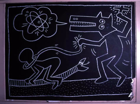
Haring's subway drawings are especially important because they used the advertising infrastructure itself. In New York subway stations, empty ad panels were often covered with black matte paper. Haring drew on those unused panels with white chalk, turning gaps in the media system into public images. Smarthistory writes that he made more than 5,000 chalk drawings from 1980 to 1985. Museum Brandhorst gives the same estimate and emphasizes that those drawings were public, accessible and brief, often disappearing when new advertising covered them.
"The subway drawings were, as much as they were drawings, performances."
That quote, published by the Keith Haring Foundation from Haring's own reflections, explains why brands later found his work so powerful. It was not just a style. It was behavior. The work existed in front of commuters. It was fast, repeatable, recognizable and democratic. It used simple symbols that could be understood at a glance: radiant babies, barking dogs, bodies in motion, televisions, angels, crowds, energy lines.
Haring also understood the uncomfortable overlap between art and commerce. He altered street advertisements early in his career, then moved into products, posters, murals, galleries and retail through the Pop Shop. His image system was not damaged by reproduction. Reproduction was part of the point. When he later worked with brands, the work did not feel like a random style hire. His language was already built for public circulation.
Major Brand Examples
The strongest examples are not just campaigns that look like graffiti. They are moments where a brand enters a real relationship with the artist, the subculture, the city or the medium. Some are beautiful. Some are commercially sharp. Some are complicated. All of them show how street art became one of the most durable sources of energy in modern advertising.
In 1986, Haring reimagined the Absolut bottle with his yellow field, red line and dancing figures. Absolut later described the campaign as part of a nearly 40-year relationship with Haring's legacy.
Haring's 1986 Swatch work translated his public symbols into wearable product and print advertising, making the wrist a moving poster.
Marc Jacobs and Stephen Sprouse turned graffiti lettering into a luxury surface in 2001, creating one of fashion's most famous graffiti-brand moments.
Futura's relationship with Nike connects graffiti, breaking, sneakers and performance apparel, including Nike's 2024 breaking collection for Paris.
Shepard Fairey's OBEY and Levi's staged a Times Square live installation and collection, using the public performance of image-making as campaign content.
KAWS shows the contemporary version of street-pop branding: luxury capsules with Dior and mass access through UNIQLO's Art For All approach.
Absolut made the bottle a gallery wall
The Absolut campaign is essential because it already treated advertising as a long-running art platform. The brand's classic structure was simple: a bottle, a visual idea, and a short caption. That constraint made artist collaborations legible. Haring's 1986 Absolut image did not need to explain itself. It placed the bottle inside his moving crowd, almost like the object had entered the dance.
Google Arts & Culture lists Haring's Absolut Vodka! as a 1986 offset lithograph, and Absolut's own 2025/2026 Haring revival describes the original work as a classic part of the 1986 campaign. The lesson for brands is still current: if the brand asset is distinctive enough, an artist can transform it without destroying recognition. The bottle stays the bottle. The culture around it changes.
Swatch made street graphics wearable
Swatch in the 1980s understood the watch as a pop object, not only a timekeeping device. Haring's Swatch work translated his signs into a product people wore every day. That matters because it collapses the distance between public image and personal identity. A subway drawing is seen collectively. A watch is chosen individually. Advertising sits between those two conditions: it wants mass reach, but it wins when people feel private ownership.
Louis Vuitton made graffiti luxury, and made luxury less polite
The 2001 Louis Vuitton graffiti bag, made with Stephen Sprouse under Marc Jacobs, remains one of the clearest luxury examples. It took the monogram, already one of the strongest repeat patterns in fashion, and interrupted it with graffiti lettering. The move worked because the clash was visible: old luxury met city noise, heritage met youth culture, polished leather met marker attitude.
This kind of collaboration also introduced a tension that still follows street art in advertising. When does translation become extraction? When does a brand honor an artist, and when does it simply rent rebellion? The answer is rarely found in the visual style alone. It depends on authorship, credit, compensation, context and whether the artist's logic shapes the work beyond surface treatment.
Nike used street art as movement, not decoration
Futura's relationship with Nike is a strong example because it connects multiple cultures that already overlap: graffiti, hip hop, breaking, sneakers and sportswear. Nike's 2024 article on Futura's breaking collection places him in the history of New York graffiti and breaking culture, including his work around the Rock Steady Crew era and the later design of federation kits and Nike Jam details.
That is a better model than simply adding spray paint texture to an ad. Nike used an artist whose history belongs to the culture being referenced. Futura's abstract language, characters and movement vocabulary made sense for breaking because breaking itself is public, physical, improvised and style-driven.
OBEY turned the campaign into the brand
Shepard Fairey's OBEY is one of the strange cases where the street campaign became a brand before many people fully understood what the brand was selling. OBEY Clothing describes its origin in Fairey's 1989 sticker intervention and positions the clothing line as an extension of art, design and cultural critique. That is important because the advertising logic is inverted. The image came first. The market followed.
The OBEY x Levi's Times Square project shows how street-art advertising can be event, product and content at once. A live installation outside a store gives people an image to watch, photograph, share and remember. It turns the making of the advertisement into the advertisement.
KAWS shows the post-streetwear era
KAWS began with interventions into advertising imagery and moved into a global language of characters, products, sculptures, fashion and collaborations. Dior's KAWS capsule describes the fusion of Dior codes with the artist's universe. UNIQLO describes KAWS as its first Artist in Residence and frames the relationship through "Art For All," with past collections including KAWS, PEANUTS, SESAME STREET, Warhol and seasonal product lines.
KAWS matters because he represents a later stage of the street-art-to-brand pipeline. The work is no longer only about bringing roughness into polished advertising. It is about IP, characters, collectibles, drops, museum partnerships and global accessibility. The wall is now also a product page, a flagship store, a sculpture plaza and a social feed.
Modern Streetwear, Calligraphy and Post-Graffiti Examples
The deeper you look, the more examples appear. Street art did not only become a visual style used by big brands. In many cases, it became the operating system for the brand itself. Skate labels, streetwear labels, lettering artists, calligraffiti painters and post-graffiti studios all converted street authorship into products, campaigns and identity systems.
Zoo York's roots go back to the Soul Artists of Zoo York, a 1970s New York crew of graffiti artists and street skaters. The commercial skate brand launched in 1993 and carried that NYC graffiti, hip hop and skate DNA into decks, T-shirts, videos and ads.
Virgil Abloh repeatedly connected Off-White to graffiti history and contemporary street art, including Futura's SS20 work and a later collaboration with graffiti artist KATSU across garments and digital experience.
Barcellona's career shows the lettering branch of street culture: a writer and calligrapher whose work moved into packaging, music, fashion, Nike, Carhartt, Zoo York and Absolut's bottle script.
The Dutch artist began tagging Shoe in 1979 and later developed Calligraffiti, fusing calligraphy and graffiti. His path also passes through design companies, advertising and brand culture.
Marc Ecko's brand is another example of graffiti becoming apparel infrastructure. Its own brand page frames ECKO as rooted in graffiti culture and street-born expression.
Supreme's artist projects show how skate brands turned decks, apparel and accessories into moving galleries for graffiti and contemporary art, including Rammellzee, Lady Pink and Futura.
Zoo York: a brand born from writers and skaters
Zoo York is not just a brand that borrowed graffiti codes after the fact. The Smithsonian's National Museum of American History describes a 1979 Zoo York skatezine created by Mark "Ali" Edmonds, leader of a group of graffiti artists and street skaters known as the Soul Artists of Zoo York. It also notes that the 1993 brand was created later by Smith, Gesner and Schatz with the blessing of the original crew. That means the brand's name is already a piece of graffiti and skate history before it becomes apparel.
This distinction matters for advertising because Zoo York did not need to simulate street credibility. Its videos, ads, decks and team culture were part of the same ecosystem as New York skateboarding, hip hop and graffiti. In that sense, Zoo York is closer to OBEY than to a conventional brand collaboration: the street language was not a campaign layer. It was the source material.
Off-White: Virgil Abloh connected runway, streetwear and graffiti archives
Off-White is a more recent and more conceptual case. The official Off-White biography frames Virgil Abloh's work as combining fashion, streetwear, art, music and architecture. In 2019, The Guardian reported that Abloh's Off-White SS20 menswear show looked to 1980s New York graffiti culture and used Futura prints. That was not a random aesthetic decision. Futura had already helped define the bridge between subway writing, streetwear, sneakers and art.
Off-White also worked with KATSU, a graffiti artist associated with experimental street practice and digital provocation. The importance here is that Off-White treated graffiti as both archive and future. Futura represented lineage; KATSU represented mutation. Together they show how modern brands use street art not only for nostalgia, but to ask what public image-making becomes after social media, gaming, drones, digital skins and product drops.
Luca Barcellona: from writing culture to commercial lettering
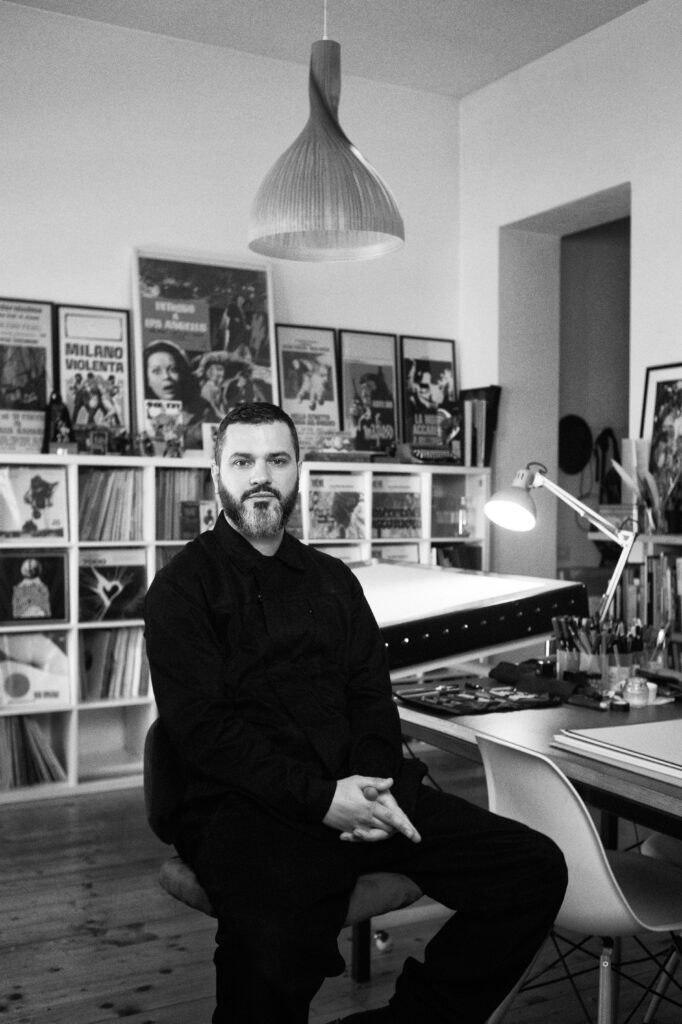
Luca Barcellona opens another door: the relationship between graffiti, calligraphy and brand identity. The Italian Calligraphy Association describes him as a Milan-based artist, graphic designer and modern calligrapher formed as both writer and designer, with roots in 1990s hip hop and Italian writing culture. His lettering has been requested by major brands, and several design sources identify his work on Absolut's packaging script.
His relevance to advertising is not only visual. Barcellona shows how the hand can become strategy. In an era of clean digital systems, calligraphy introduces imperfection, rhythm, pressure, authorship and time. For brands, that can create human presence without pretending to be raw graffiti. It is a more refined branch of the same history: letters as identity, gesture as proof.
Niels Shoe Meulman: Calligraffiti and the European lineage
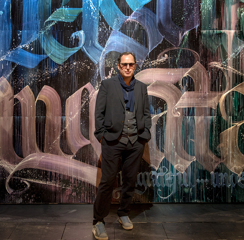
Niels Shoe Meulman is essential for the European chapter. His Calligraffiti site states that he began tagging Shoe in 1979, became a graffiti legend by 18, met artists including Dondi White, Rammellzee and Keith Haring in the 1980s, and later formed Crime Time Kings with Bando and Mode2. In the 1990s he moved through graphic design and advertising before defining Calligraffiti in 2007.
This is a crucial modern example because it refuses the false split between craft and street. Calligraphy is old-world discipline. Graffiti is modern public disruption. Meulman's work fuses the two, which is exactly why it became useful to galleries, brands, posters, products and editorial design. It gave advertising a way to use writing that felt both trained and alive.
ECKO, Stussy and the graphic birth of streetwear
ECKO UNLTD. and Stussy show two related paths. ECKO's own brand story presents the company as a hand-drawn vision rooted in graffiti culture that grew into a global movement. Stussy came from surf, not graffiti writing, but its own history describes Shawn Stussy's logo as a graffiti-influenced hand style that moved from surfboards to shirts and then into a global youth network. Both prove the same point: once a mark becomes socially desirable, the mark can become the brand.
Supreme turned products into an art-collaboration archive
Supreme is not a graffiti brand in the same way Zoo York is, but its artist-collaboration model is impossible to ignore. Supreme's own deck archive includes KAWS, Rammellzee, Lady Pink and Futura among many contemporary artists. Its Rammellzee release notes his 1970s A-train graffiti history and Gothic Futurist lettering. The skateboard deck becomes a portable art surface: not quite a wall, not quite a poster, not quite a product, but all three at once.
The Netherlands and machine-made energy
The Dutch scene is full of hybrids between graffiti, design, machines and brand culture. One contemporary example is Antigoon, a Dutch machine graphic artist whose Tchai project describes a background in graffiti evolving into self-built printing-machine work. If the "Machine with Energy" example is the one you had in mind, this may be the right direction: graffiti influence moving into kinetic, mechanical, system-driven visual identity rather than classic spray work.
Why Brands Keep Returning to Street Art
Brands return to street art because it carries signals that corporate communication struggles to manufacture. Street art suggests presence: somebody was here. It suggests risk: the image had to be placed, not merely published. It suggests locality: even when the artist becomes global, the language still feels tied to walls, neighborhoods and scenes. It suggests energy: gesture, speed, repetition, color, scale, attitude.
For advertising, those signals are valuable because audiences are trained to ignore polished messaging. Street art interrupts the expected tone. It can make a brand feel less like an institution and more like a participant in culture. That is why the most convincing campaigns often include process: live painting, artist interviews, limited editions, city-specific murals, public installations and documentary photography.
It also gives people something to investigate. A mural has an author. A logo has a lineage. A campaign has a city behind it, a photographer behind the image, a legal question somewhere in the background, and often a small argument about whether the brand came correct. That is why this subject keeps producing good stories: the surface is loud, but the history underneath it is rarely simple.
What Makes It Work Without Feeling Fake
The best street-art brand collaborations usually share five traits.
- Real authorship. The artist is named, visible and credited. The work is not anonymous graffiti flavor applied by a campaign team.
- Cultural fit. The artist's history connects to the brand's context, product, place or audience.
- Clear constraint. The brand asset remains recognizable, but the artist has enough space to transform it.
- Public life. The campaign exists somewhere beyond a feed: wall, poster, store, street, event, product, book or exhibition.
- Respect for origin. The work acknowledges that graffiti and street art came from contested public space, not from a trend deck.
When those traits are missing, the result often feels thin. A spray texture, a fake tag, a mural-style background or distressed typography cannot carry the cultural weight by itself. Street art is not a Photoshop filter. It is a history of visibility, ownership, risk and voice.